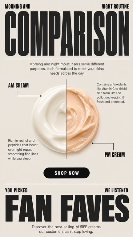
Create a modern, bold editorial skincare marketing graphic. Warm greige / off-white background, lots of clean structure, thin horizontal divider lines separating sections. TYPOGRAPHY: heavy, condensed, tightly-spaced uppercase sans-serif for the big headline; small bold uppercase labels; light regular sans-serif for body text. All type in near-black charcoal. TOP SECTION: - Two small bold uppercase labels flanking the top: left "MORNING AND", right "NIGHT ROUTINE" - Below them, one giant condensed bold headline: "COMPARISON" - A thin horizontal line under it - A short centered intro paragraph in light gray sans-serif: "Morning and night moisturisers serve different purposes, each formulated to meet your skin's needs across the day." CENTER PRODUCT: - A single round, glossy product blob in the middle, split down the exact center by one thin vertical line • LEFT half: creamy ivory / white moisturiser, smooth and dewy • RIGHT half: soft warm peach cream, thicker and buttery - Thin L-shaped connector (leader) lines pointing to the blob: • Top-left label "AM CREAM" with a line pointing in • Bottom-right label "PM CREAM" with a line pointing in TEXT AROUND PRODUCT: - Upper-right block: "Contains antioxidants like vitamin C to shield skin from UV and pollution, keeping it fresh and protected." - Lower-left block: "Rich in retinol and peptides that boost overnight repair, smoothing fine lines while you sleep." CALL TO ACTION: - A black pill-shaped button, centered, white uppercase text: "SHOP NOW" BOTTOM SECTION: - Thin divider line, then two small labels: left "YOU PICKED", right "WE LISTENED" - Giant condensed bold headline: "FAN FAVES" - Small centered caption: "Discover the best-selling AURÉE creams our customers can't stop loving." STYLE: premium beauty branding, high-contrast bold typography, minimal, structured grid, subtle soft shadows, neutral greige palette with ivory + peach accents. Brand name feel: AURÉE.